Context
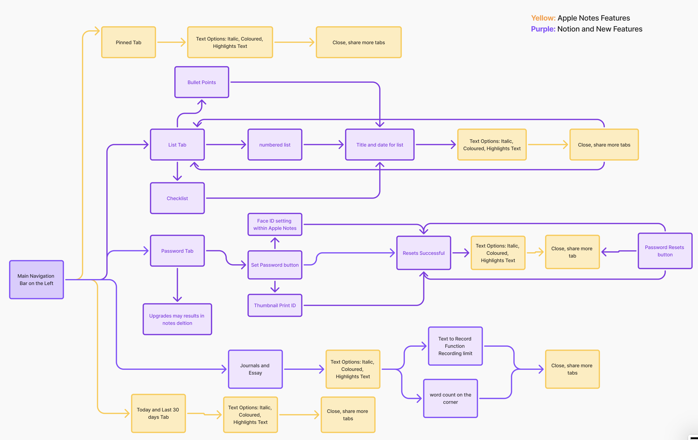
Apple Notes is one of the most commonly used apps for everyday tasks, quick ideas, and personal information. As users rely on it for more types of content—notes, passwords, reminders, recordings—the app’s simple structure becomes limiting. This project explores these limitations by creating interactive prototypes that test improved organization and usability
7 min read
Project
Feature Integration Case Study
Feature Integration Case Study
Project type and Duration
Independnt conceptual summer project
Independnt conceptual summer project
Skillsets
Ideation (User research, personas and workflow)
Hi fidelity and low fidelity prototypes (Figma)
Ideation (User research, personas and workflow)
Hi fidelity and low fidelity prototypes (Figma)
Problem statement
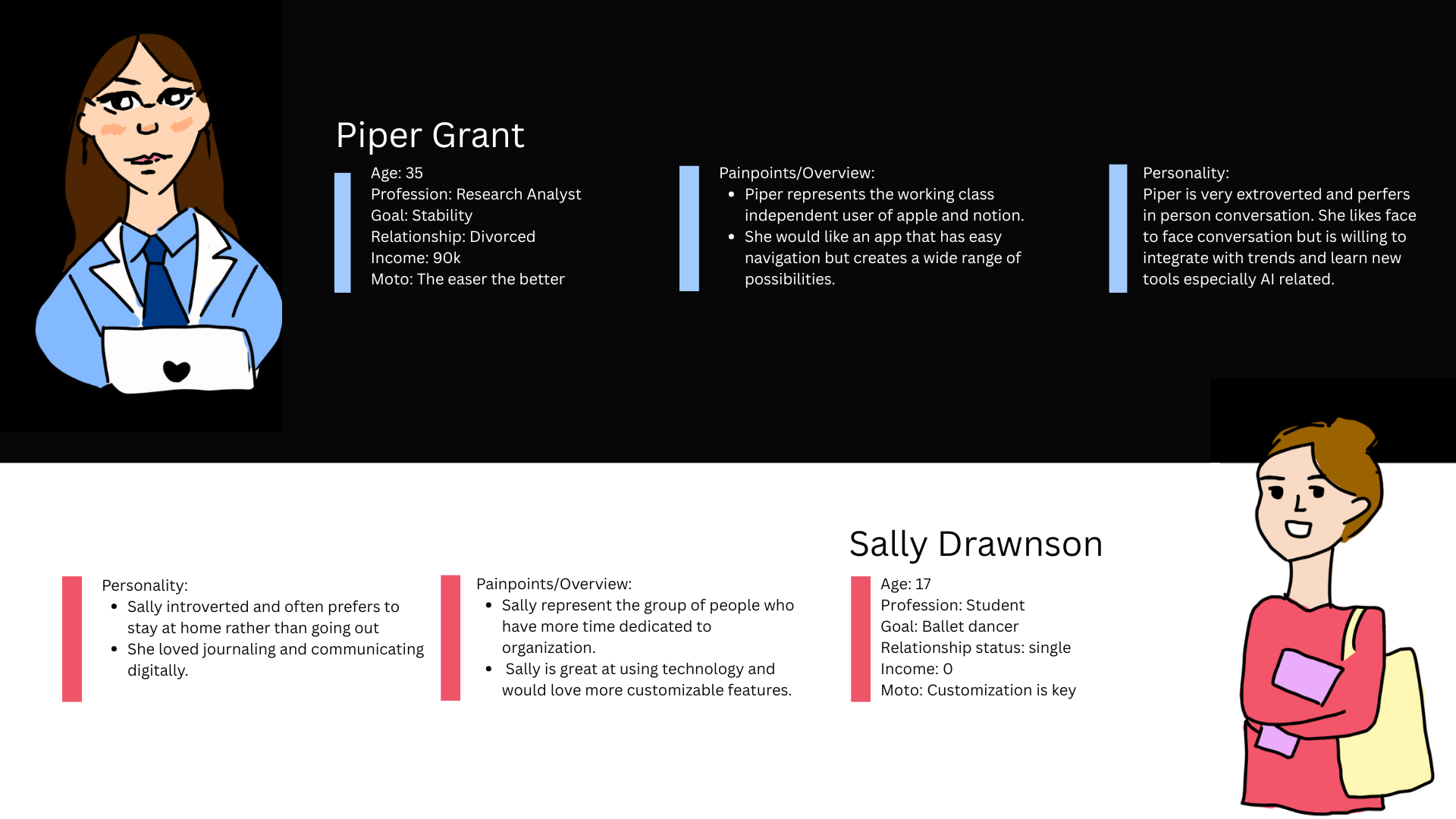
Users struggle to keep important information organized in Apple Notes. They often lose track of password updates, recordings, and other key items because the app lacks stronger organizational tools. This project aims to improve the system by integrating Notion-inspired usability while maintaining Apple’s clean and familiar design.
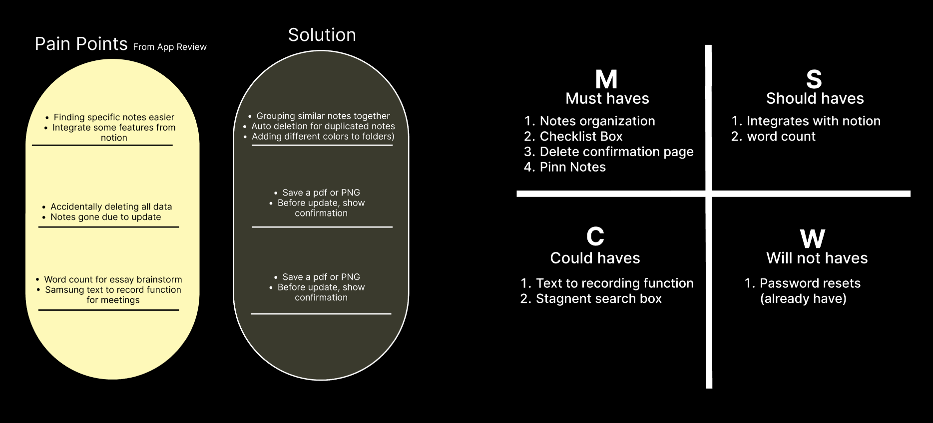
User Pain points:
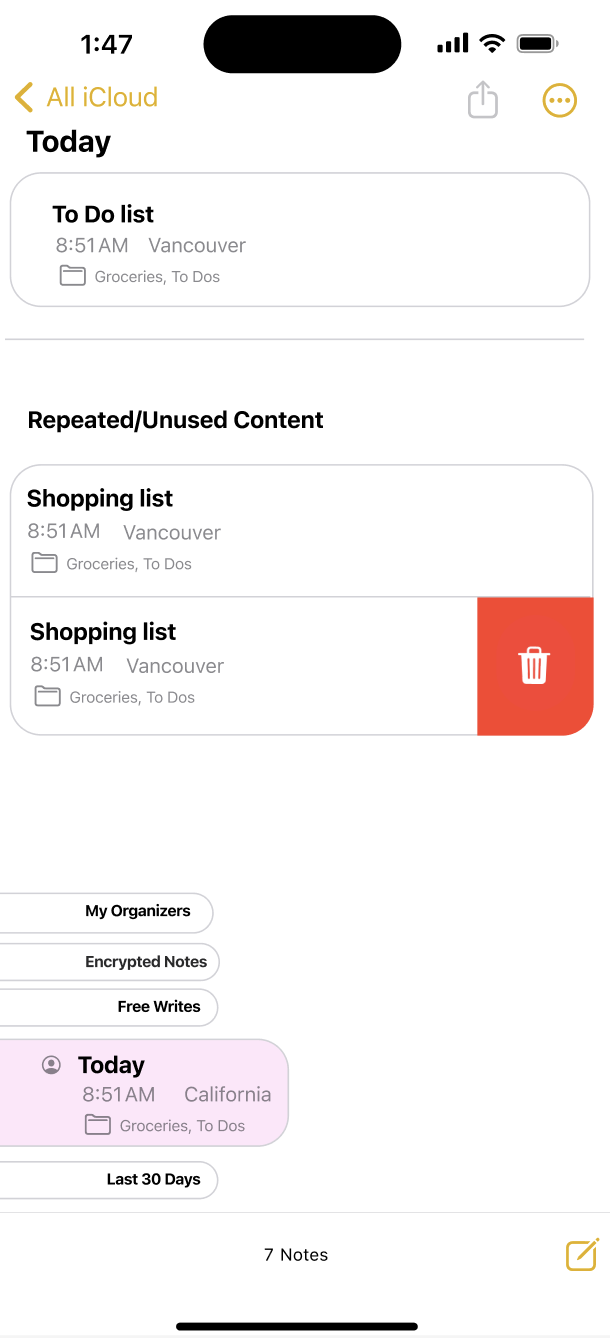
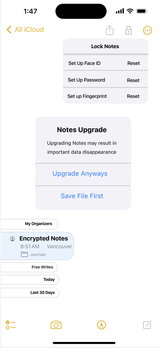
My notes has disapeared out of nowhere
Just a really useful app. If you guys could lean it in the direction of notion, it would be even better!
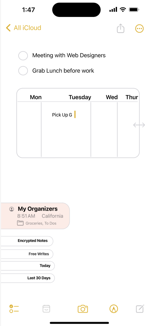
If you search and find anything you can't go back up the hiearchy to find the source folder
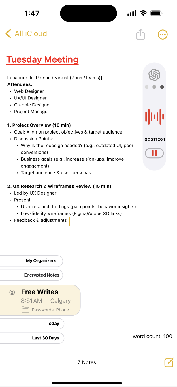
Recording and writing simultaneouly feature would help greatly
It's missing one major feature that would improve its functionality- a word count