Katsu Sando
The Big Idea
Year
/
2024
Client
/
Katsu Sando LA
Katsu Sando, a Japanese pork cutlet sandwich shop located in LA is made to bring unique, home-cooked flavours for all to share. Their current brand identity shows a disconnect between the current product and its overall goals. This project explores how a redesign could better align and refine the product’s identity.
Katsu Sando, a Japanese pork cutlet sandwich shop located in LA is made to bring unique, home-cooked flavours for all to share. Their current brand identity shows a disconnect between the current product and its overall goals. This project explores how a redesign could better align and refine the product’s identity.
Problem
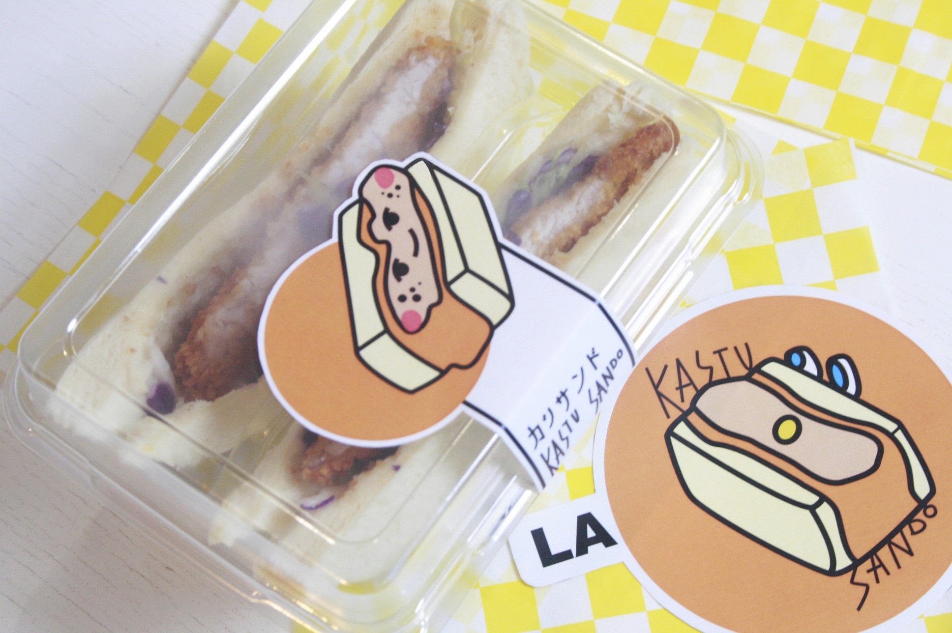
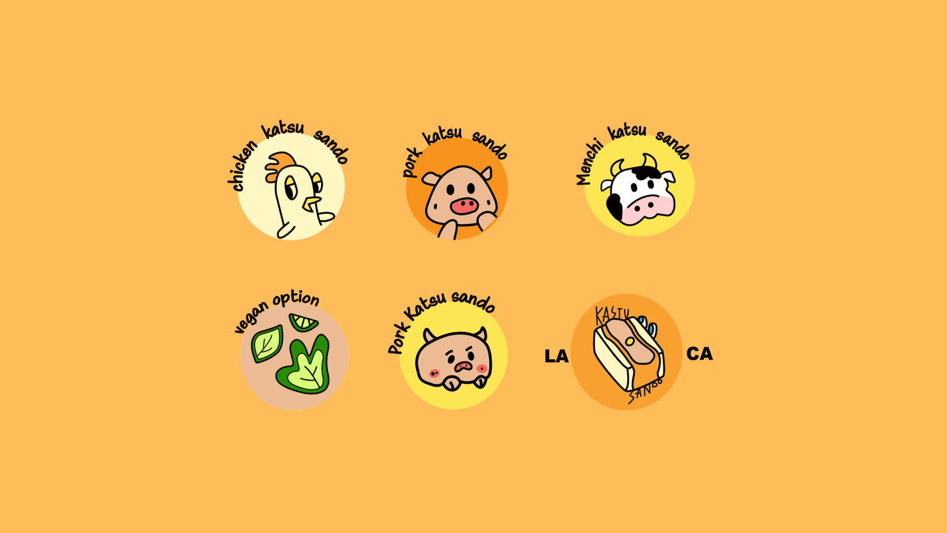
The existing visual identity created a disconnect between the brand experience and the product itself. While the shop specializes in Japanese-American fusion Katsu Sandos, the original branding leaned heavily toward playful American cartoon aesthetics, making the brand feel alienated from its culinary identity and homemade appeal.
The existing visual identity created a disconnect between the brand experience and the product itself. While the shop specializes in Japanese-American fusion Katsu Sandos, the original branding leaned heavily toward playful American cartoon aesthetics, making the brand feel alienated from its culinary identity and homemade appeal.

Solution
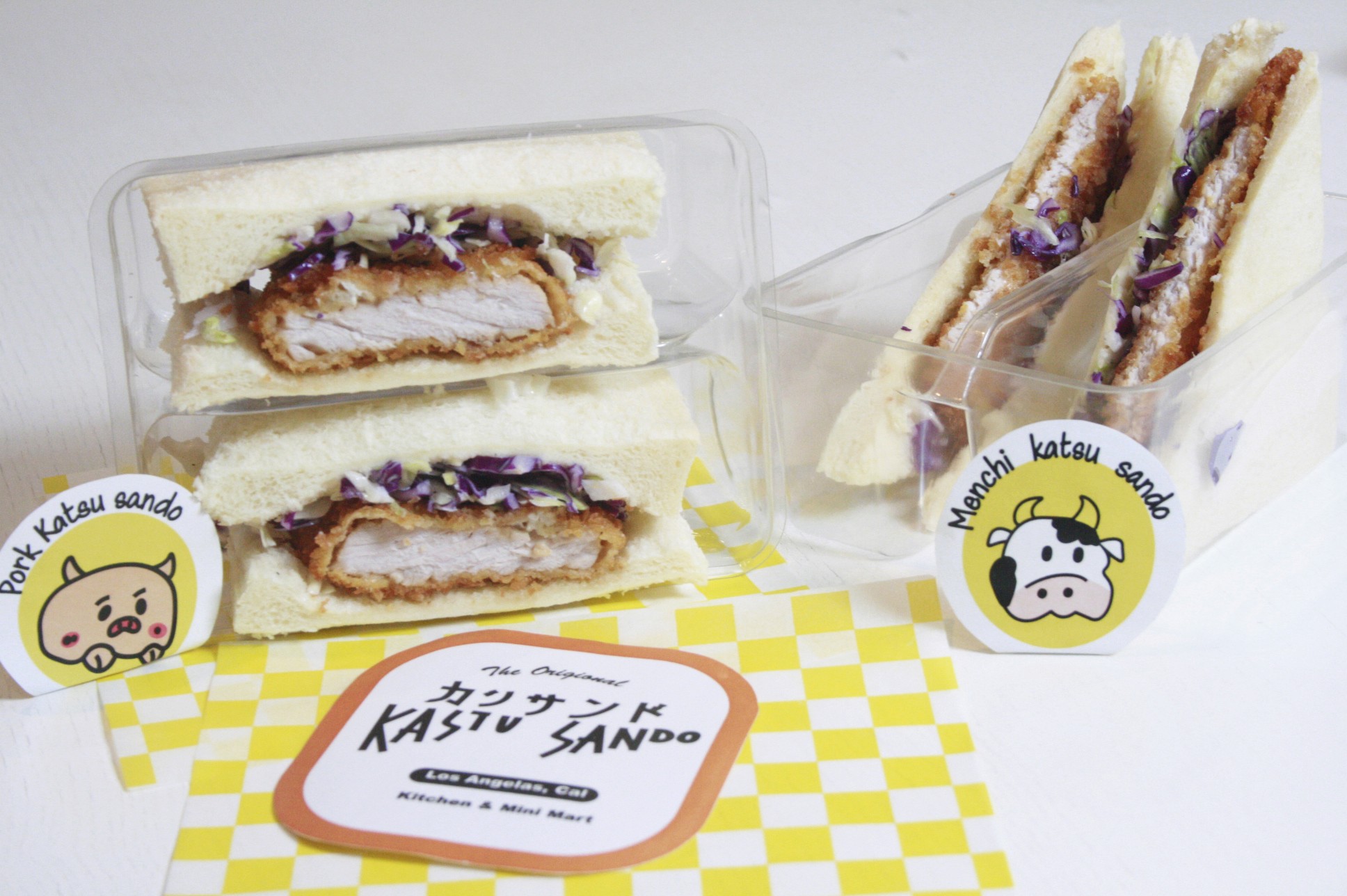
The rebrand repositions the shop through a more intentional fusion-driven identity, balancing playful familiarity with authentic homemade warmth. Inspired by Japanese convenience store culture and family-oriented dining experiences, the redesigned system emphasizes comfort, approachability, and crafted flavours while creating a stronger emotional connection with children and families as the primary audience.
The rebrand repositions the shop through a more intentional fusion-driven identity, balancing playful familiarity with authentic homemade warmth. Inspired by Japanese convenience store culture and family-oriented dining experiences, the redesigned system emphasizes comfort, approachability, and crafted flavours while creating a stronger emotional connection with children and families as the primary audience.


The Results
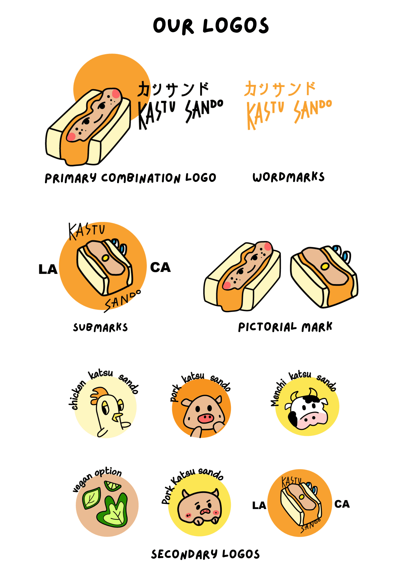
The result is a cohesive brand system grounded in warmth and culture, strengthening recognition and emotional clarity. Katsu Sando is positioned as a thoughtful and memorable fusion brand, supported by a warm orange-yellow palette informed by research on appetite stimulation.
View Next Project

Capstone Festival Branding