WestJet Streamline
The Big Idea
Year
/
2025
Client
/
WestJet
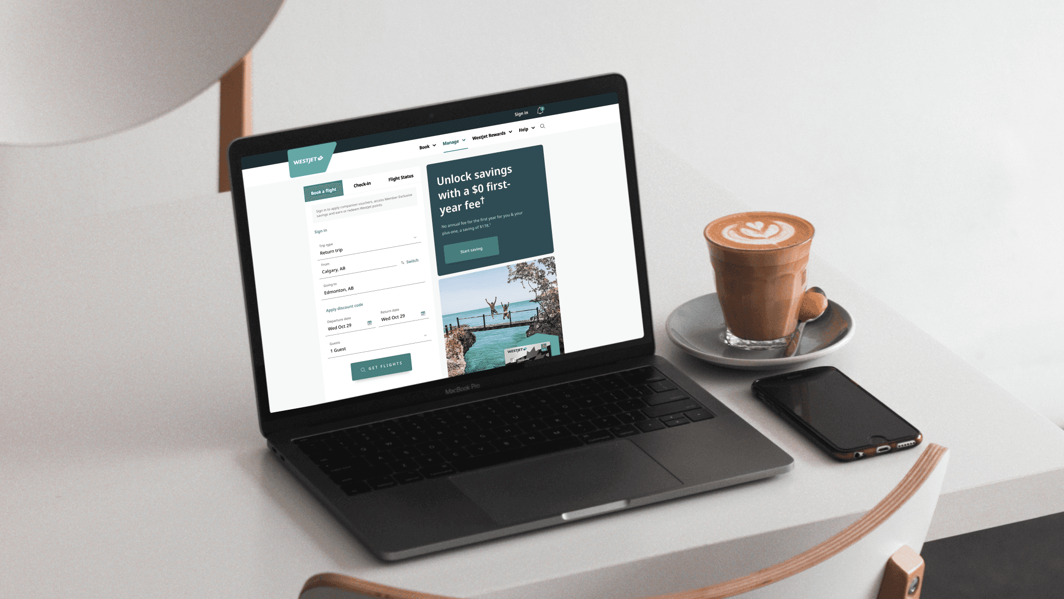
WestJet’s booking system prioritizes comprehensive information, but this creates friction for users booking spontaneous or budget-focused trips. This project addresses those concerns by adjusting WestJet's desktop user experiences through simplified information architecture, streamlined user flow, and reusable design systems.
WestJet’s booking system prioritizes comprehensive information, but this creates friction for users booking spontaneous or budget-focused trips. This project addresses those concerns by adjusting WestJet's desktop user experiences through simplified information architecture, streamlined user flow, and reusable design systems.


Problem
Travellers booking through WestJet often encounter a detailed booking flow that can feel overwhelming, particularly for last-minute and budget-conscious users who prioritize speed and clarity. The core issue is the tension between providing essential information and maintaining an efficient, frictionless experience.
Travellers booking through WestJet often encounter a detailed booking flow that can feel overwhelming, particularly for last-minute and budget-conscious users who prioritize speed and clarity. The core issue is the tension between providing essential information and maintaining an efficient, frictionless experience.

Solution
Our solution simplifies and clarifies the booking journey, reducing friction across key steps to help users book flights faster, with less cognitive load and greater confidence.
Our solution simplifies and clarifies the booking journey, reducing friction across key steps to help users book flights faster, with less cognitive load and greater confidence.


The Results
These changes created a faster and more intuitive booking flow, particularly for last-minute and budget-focused travelers. During usability testing, users navigated the platform with less hesitation, identified fare differences more quickly, and completed tasks with greater confidence. The redesign also showed a potential 10% increase in user retention, suggesting improved engagement throughout the booking experience.

View Next Project

Sunny Side Market Campaign