Context
Food waste is a constant growing issue, with many households groceries being thrown away due to quick spoilage, over-purchase, or poor detailed organization. Spoilert aims to help users track expiry dates, manage shared groceries, and reduce waste through smarter food management. In result the usability test showcase smooth, easy navigation and high completion rate.
7 min read
Conceptual Digital App
4 Month school project
1 UX/UI Designer
2 Graphic Designer
1 Web Designer
Branding (Illustrator)
Wireframe and Prototypes (Figma)
Contribution and Project Timeline
Phase 1 (September )
Define Problem, goal, conduct user survey. Discuss what's feasible, what are the constrains.
Phase 2 (October )
Identify Solutions: Distribute tasks. Start crafting brand identity and create Low Fidelity wireframes
Phase 3 (November )
Craft Hi Fidelity wireframes in Figma and start prototyping with full brand identity.
Phase 4 (December )
Conduct user testing survey, refine and ready for launch!
Every year, 631 million tonnes of food gets wasted per household due to spoilage. Imagine:
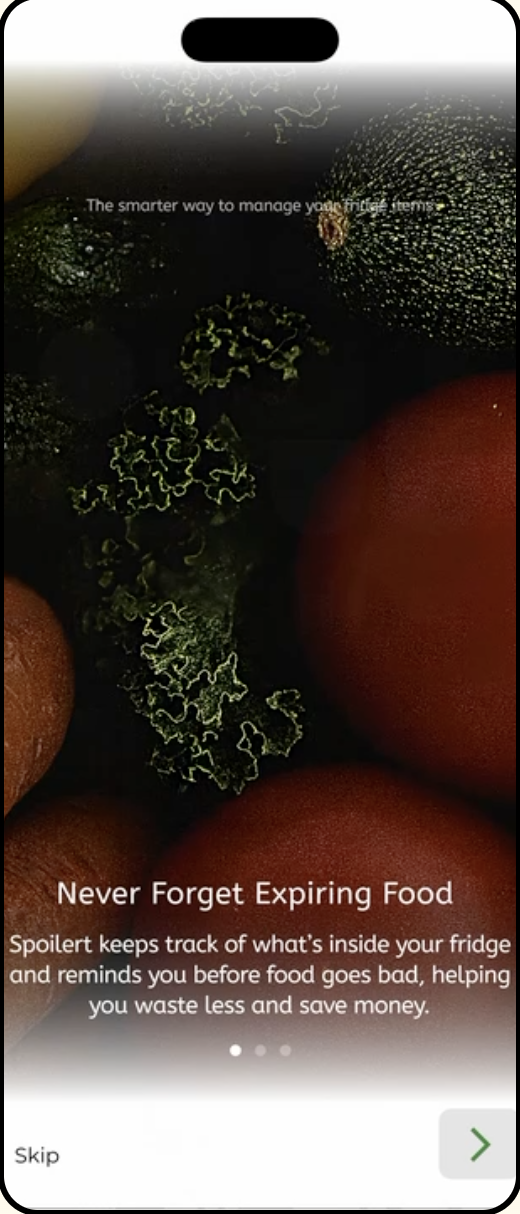
An app that tells you when you brought a produce, how long it can last after opening, tips on how to store fresh produce and even automatically rewrite weekly grocery lists. That is Spoilert
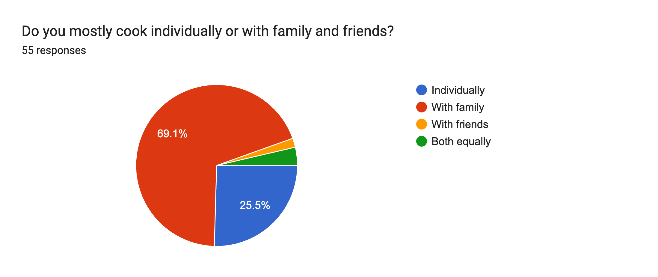
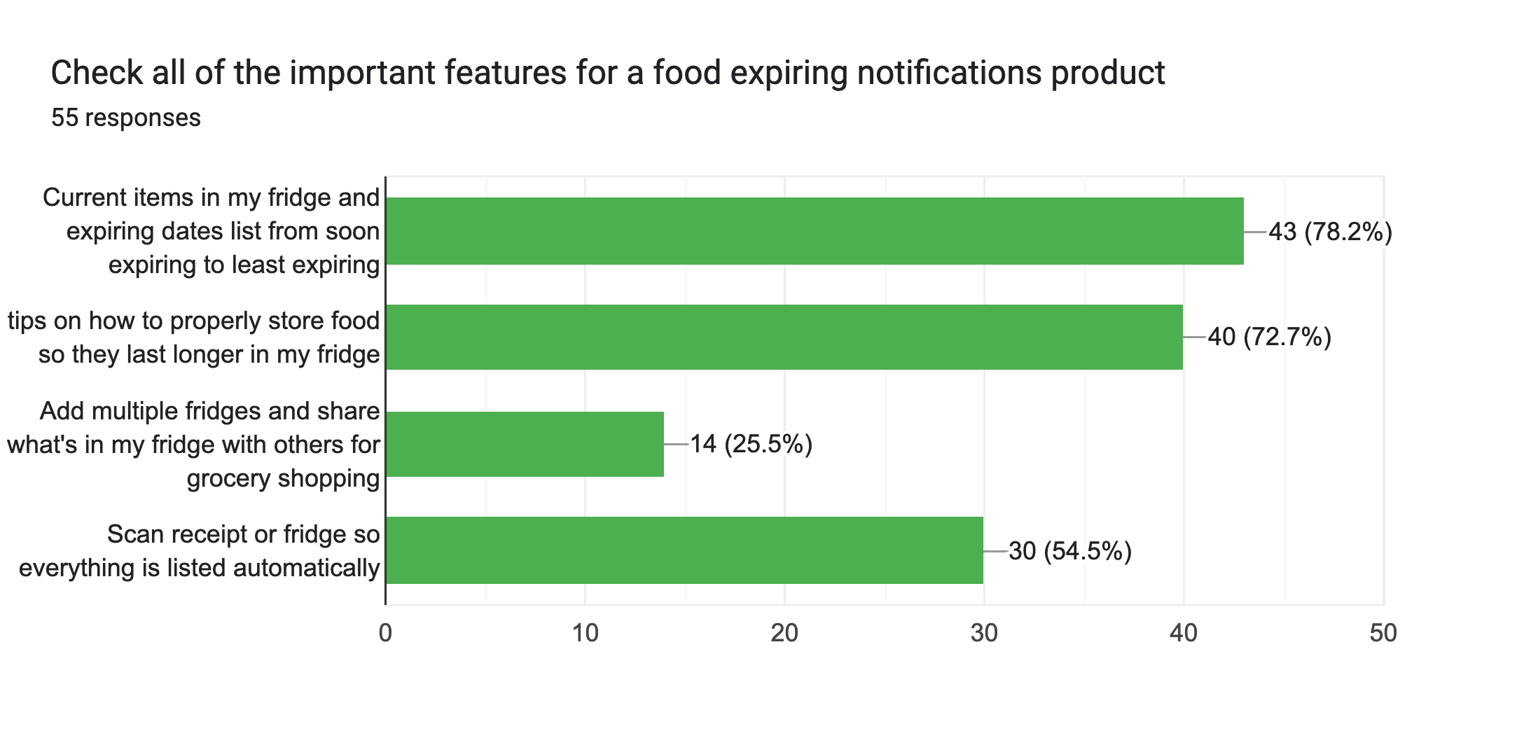
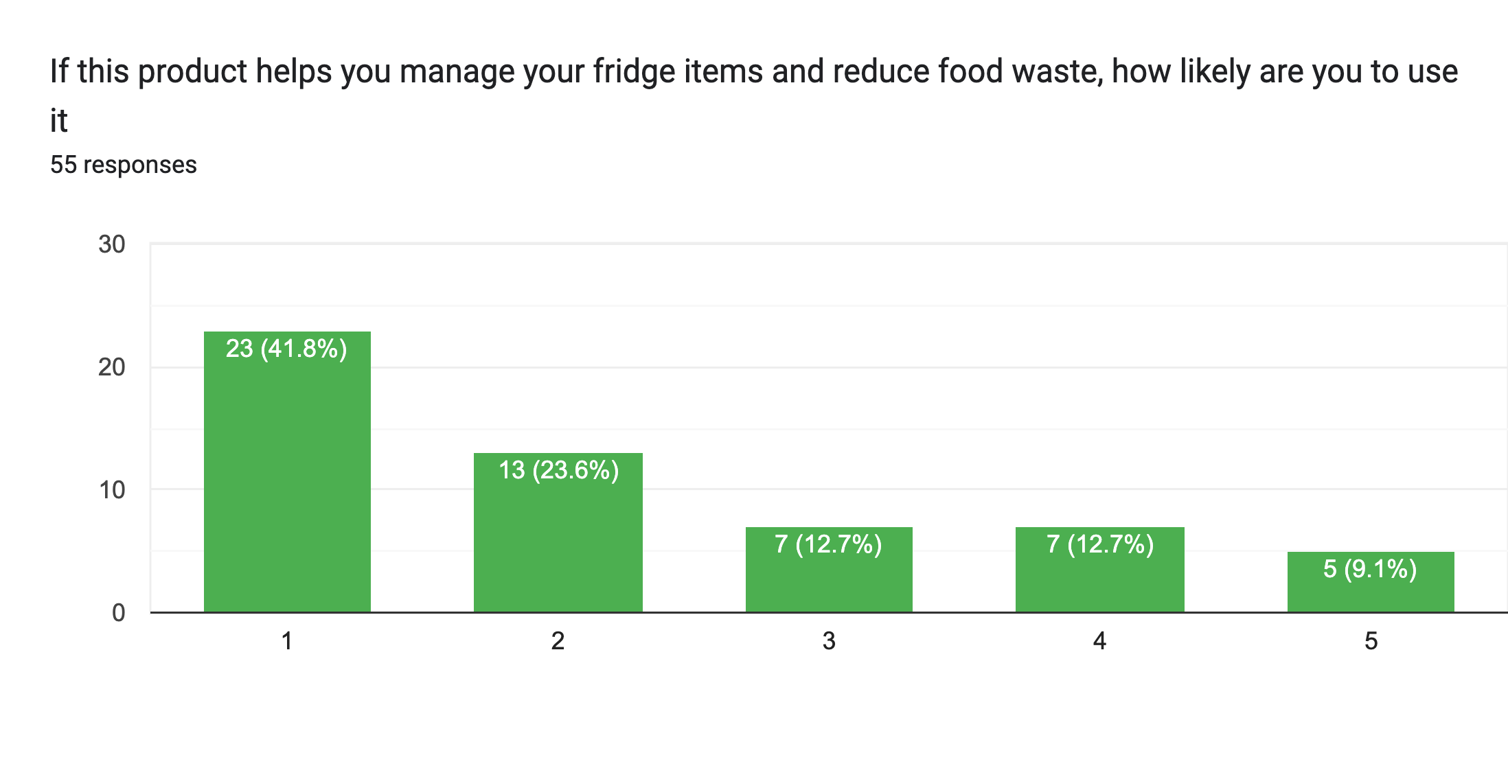
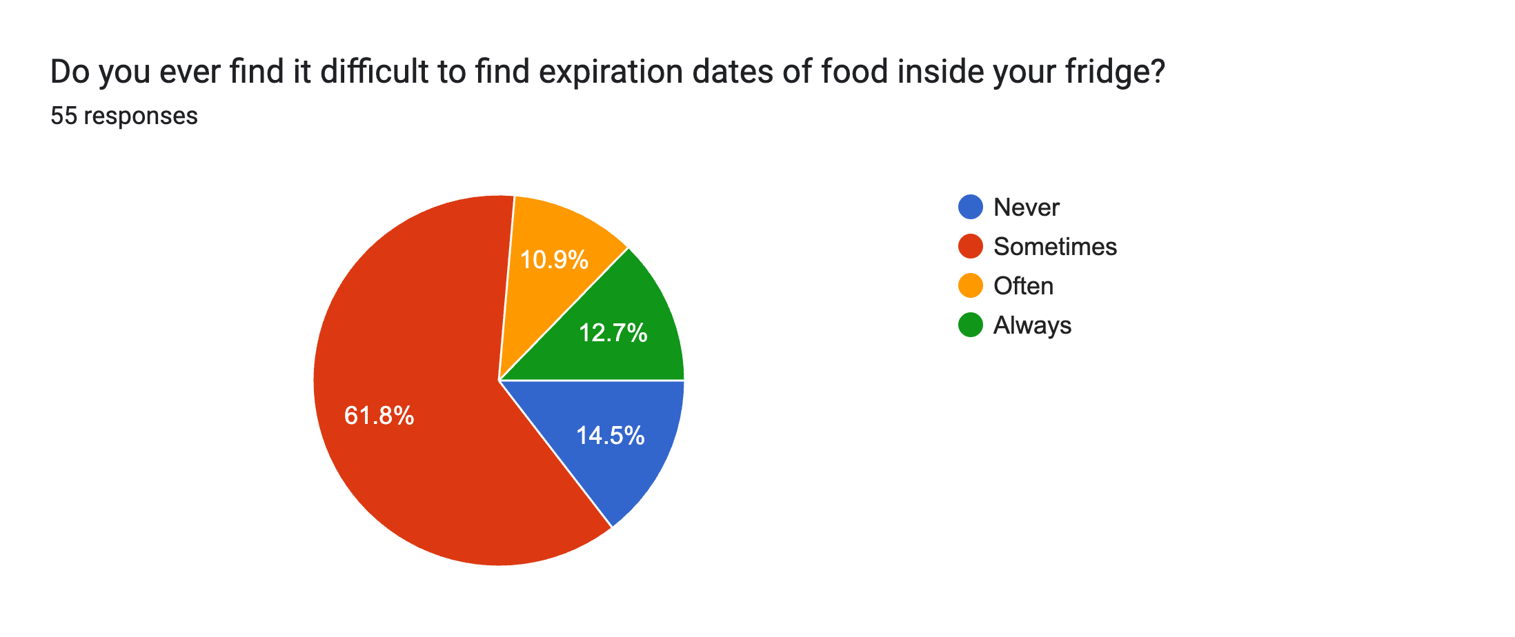
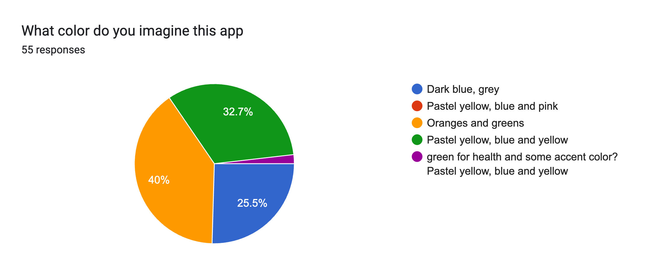
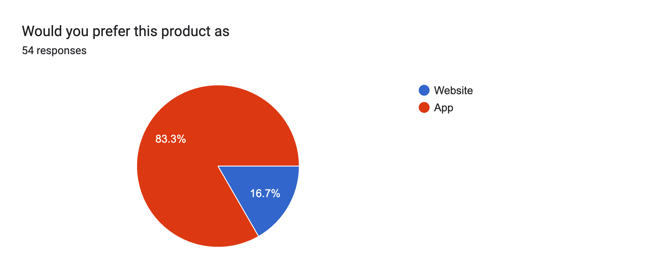
From the problem, we surveyed 55 Individuals from different age group and backgrounds, and our main pain points includes:
Prototype Overview
Logo Designs
Peers noted that the first logo appears fresh, vibrant, and effectively communicates the idea of keeping food fresh. In contrast, the second logo was perceived as distorted and visually associated with spoiled or deteriorated food.
Chosen Logo:
The first logo variation was selected because it best reflects the brand’s overall goals. It stands out as unique, conveys freshness clearly, and incorporates a playful visual wordplay that aligns with the brand’s fun and approachable personality.

Wireframe
.png)
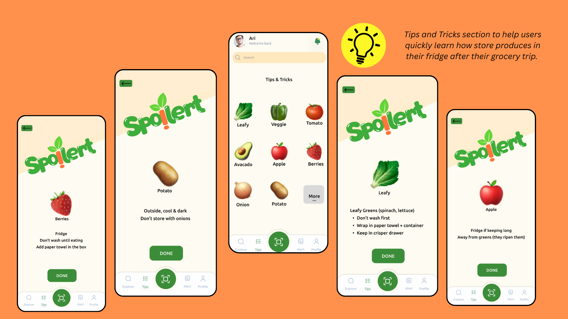
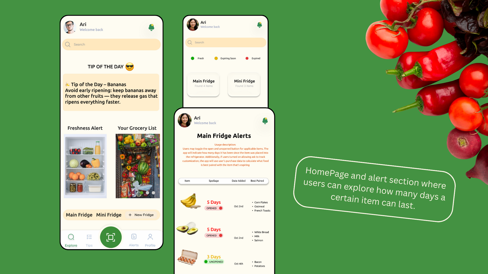
Main Features

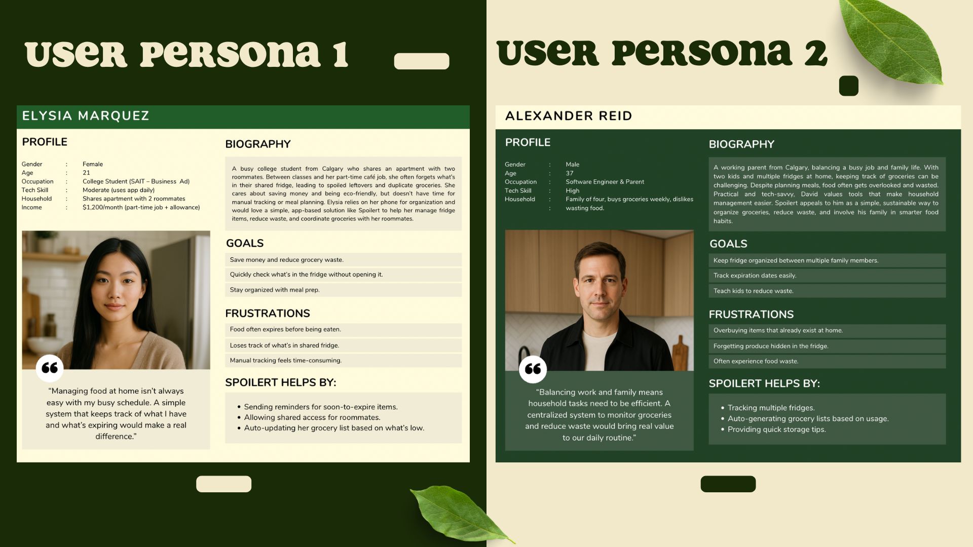
User Persona
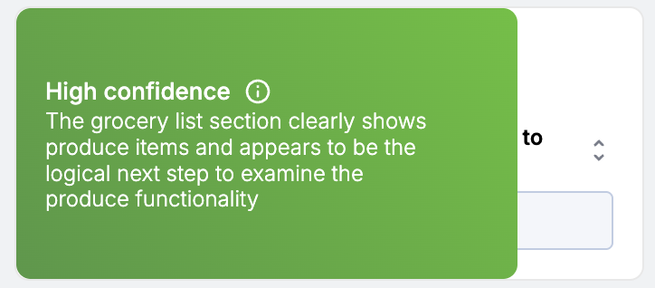
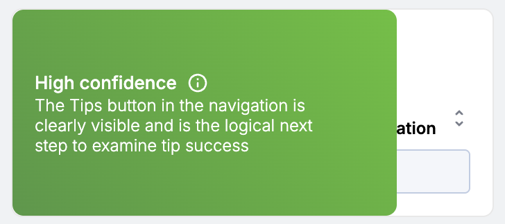
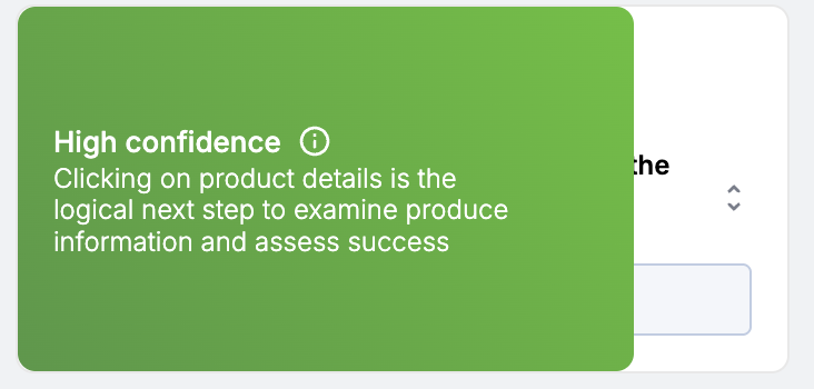
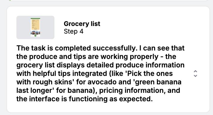
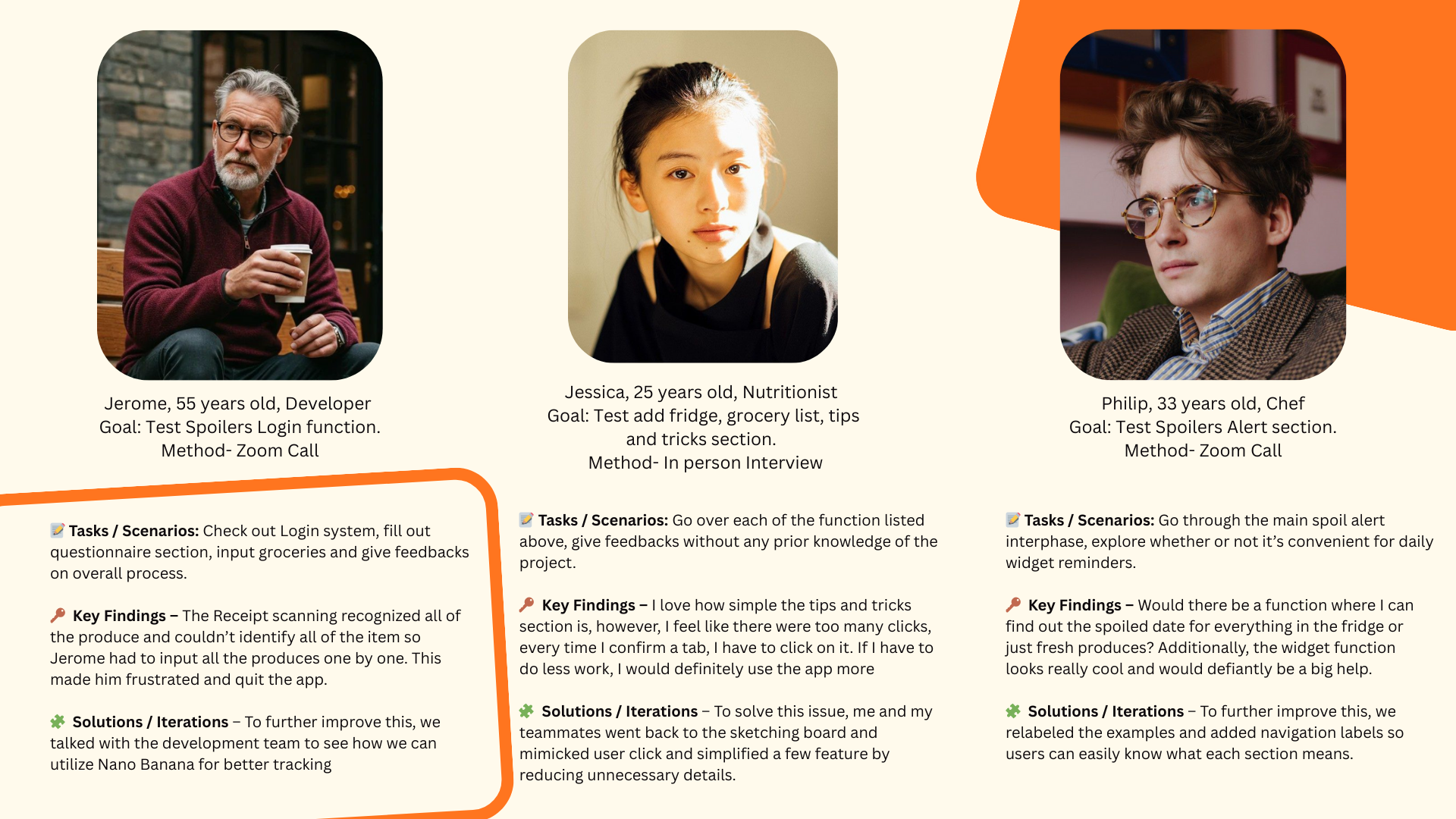
Usability Testing and Feedbacks
Key Takaways
What have I learned? 🤩
What should we do next? ⏭
1. How to make intentional design decisions that lead to results based on fact and research instead of simply designing for visuals. An example for this is the expiry tracking and shared groceries to address everyday and most votes user pain points.
2. How to stayed organized throughout the process and kept the scope realistic. By creating a realistic gant chart, everyone was able to complete each sections within a realistic timeline
1. Improve the interactions and flows to make the user experience feel smoother by reducing clicks and adding screen readers to facilitate accessibility.
2. Refine the UI further to ensure clarity, consistency, I would love to work with a developer for the higher-fidelity prototype to better demonstrate the full user journey.